QT GUI Chooser: Difference between revisions
Jump to navigation
Jump to search
(replaced pictures) |
|||
| Line 7: | Line 7: | ||
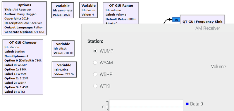
This shows the QT GUI Chooser block and how it looks in the output. | This shows the QT GUI Chooser block and how it looks in the output. | ||
[[File:FunCube_AM_out.png]] | [[File:FunCube_AM_out.png|800px]] | ||
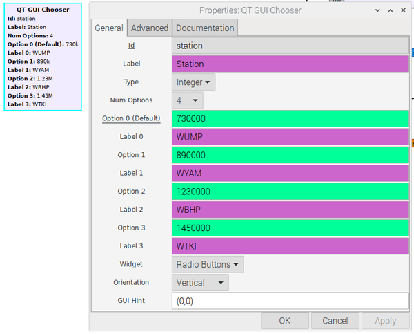
Here are what the parameters of the Chooser looked like: | Here are what the parameters of the Chooser looked like: | ||
[[File:FunCube_AM_prop.png| | [[File:FunCube_AM_prop.png|600px]] | ||
[[Category:Block Docs]] | [[Category:Block Docs]] | ||
Revision as of 02:01, 16 April 2020
This block creates a variable with enumerated options. The gui widget is implemented as a combo box or radio button group. When the label is left blank, the option will be used as the label. Set the number of options to "list" to enter a single list of options and labels.
See GUI Hint for how to position the GUI within your window.
Example Flowgraph
This shows the QT GUI Chooser block and how it looks in the output.
Here are what the parameters of the Chooser looked like:

