QT GUI Chooser: Difference between revisions
(replaced pictures) |
(add example of using the "List" number of options) |
||
| (2 intermediate revisions by the same user not shown) | |||
| Line 1: | Line 1: | ||
This block creates a variable with enumerated options. The gui widget is implemented as a combo box or radio button group. When the label is left blank, the option will be used as the label. | <!-- QT_GUI_Chooser.mediawiki --> | ||
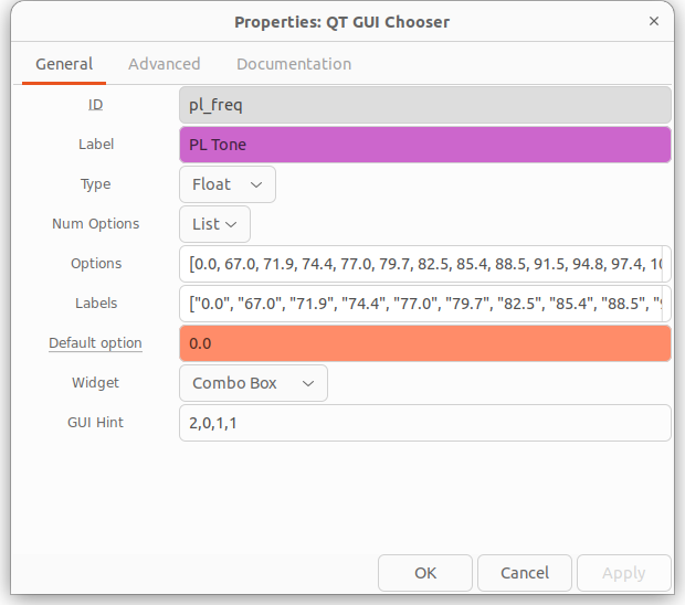
This block creates a variable with enumerated options. The gui widget is implemented as a combo box or radio button group. When the label is left blank, the option will be used as the label. If the number of options is greater than five, or you would rather enter a list, set the number of options to "list" to enter a list of options and a list of labels. See an example below. Note that the "Default option" must be one of the Option values. | |||
== Parameters == | |||
<b>(''R''):</b> <span class="plainlinks">[https://wiki.gnuradio.org/index.php/GNURadioCompanion#Variable_Controls ''Run-time adjustable'']</span> | |||
See [[GUI Hint]] for how to position the GUI within your window. | See [[GUI Hint]] for how to position the GUI within your window. | ||
== Example Parameters == | |||
Here is an example of using the "List" option. A flowgraph using this option can be found at [https://raw.githubusercontent.com/duggabe/gr-control/main/Transmitters/NFM_xmt.grc]<br> | |||
[[File:QT_GUI_Chooser_prop.png]] | |||
== Example Flowgraph == | == Example Flowgraph == | ||
| Line 7: | Line 17: | ||
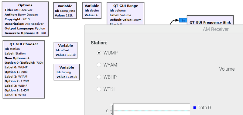
This shows the QT GUI Chooser block and how it looks in the output. | This shows the QT GUI Chooser block and how it looks in the output. | ||
[[File:FunCube_AM_out.png]] | [[File:FunCube_AM_out.png|800px]] | ||
<br><br> | |||
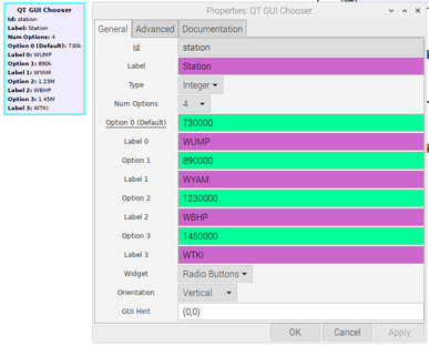
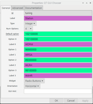
<b>Note:</b> <code>Added field for 3.8.1 in July 2020</code> The "Option 0 (Default)" field has been split into two fields: "Default option" and "Option 0". Whereas the old format forced the default value to be entered as Option 0, the new format allows any of the options to be the default value. Here are what the parameters of the Chooser look like before and after: | |||
[[File:FunCube_AM_prop.png|387px]] [[File:QT_GUI_CHOOSER_prop.png|303px]] | |||
== Source Files == | |||
; C++ files | |||
: [https://github.com/gnuradio/gnuradio TODO] | |||
; Header files | |||
: [https://github.com/gnuradio/gnuradio TODO] | |||
; Public header files | |||
: [https://github.com/gnuradio/gnuradio TODO] | |||
[ | ; Block definition | ||
: [https://raw.githubusercontent.com/gnuradio/gnuradio/main/gr-qtgui/grc/qtgui_chooser.block.yml] | |||
[[Category:Block Docs]] | [[Category:Block Docs]] | ||
Latest revision as of 15:37, 18 May 2022
This block creates a variable with enumerated options. The gui widget is implemented as a combo box or radio button group. When the label is left blank, the option will be used as the label. If the number of options is greater than five, or you would rather enter a list, set the number of options to "list" to enter a list of options and a list of labels. See an example below. Note that the "Default option" must be one of the Option values.
Parameters
(R): Run-time adjustable
See GUI Hint for how to position the GUI within your window.
Example Parameters
Here is an example of using the "List" option. A flowgraph using this option can be found at [1]
Example Flowgraph
This shows the QT GUI Chooser block and how it looks in the output.
Note: Added field for 3.8.1 in July 2020 The "Option 0 (Default)" field has been split into two fields: "Default option" and "Option 0". Whereas the old format forced the default value to be entered as Option 0, the new format allows any of the options to be the default value. Here are what the parameters of the Chooser look like before and after:
Source Files
- C++ files
- TODO
- Header files
- TODO
- Public header files
- TODO
- Block definition
- [2]


