QT GUI Toggle Button: Difference between revisions
Jump to navigation
Jump to search
No edit summary |
|||
| Line 61: | Line 61: | ||
== Source Files == | == Source Files == | ||
; | ; Python files | ||
: [https://github.com/gnuradio/gnuradio | : [https://github.com/gnuradio/gnuradio/blob/main/gr-qtgui/python/qtgui/togglebutton.py] | ||
; Block definition | ; Block definition | ||
: [https://github.com/gnuradio/gnuradio | : [https://github.com/gnuradio/gnuradio/blob/main/gr-qtgui/grc/qtgui_togglebutton.block.yml] | ||
[[Category:Block Docs]] | [[Category:Block Docs]] | ||
Latest revision as of 10:27, 18 November 2022
This block creates a variable toggle button. Leave the label blank to use the variable id as the label.
A toggle button selects between two values of similar type, but will stay depressed until clicked again. The variable will take on one value or the other depending on whether the button is pressed or released.
This button also will produce a state message matching the set values.
Added in 3.9
Parameters
(R): Run-time adjustable
- Id
- The variable name
- Label
- the name for the LED
- Type
- options: [Float, Integer, String, Boolean]
- Default Value
- default: 0
- Initial State
- options: [Released, Pressed]
- Pressed
- default: 1
- Released
- default: 0
- Message Property Name
- default: value
- Released Background
- options: [default, silver, gray, black, white, red, green, blue, navy, yellow, orange, purple, lime, aqua, teal]
- Released Font Color
- options: see above
- Pressed Background
- options: see above
- Pressed Font Color
- options: see above
See GUI Hint for how to position the GUI within a window.
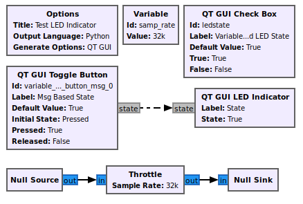
Example Flowgraph
This flowgraph can be found at [1]
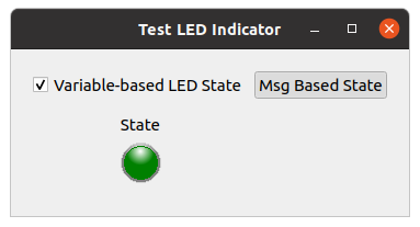
Example Output
The Msg Based State widget is the Toggle Button.
Source Files
- Python files
- [2]
- Block definition
- [3]

